


A pop of Color
Showcased in this section is a mix of work that I have done for various clients or In house for brands. You will also find some of these works included in later sections with more context and some of my design process.


MERLIN ENTERTAINMENTS
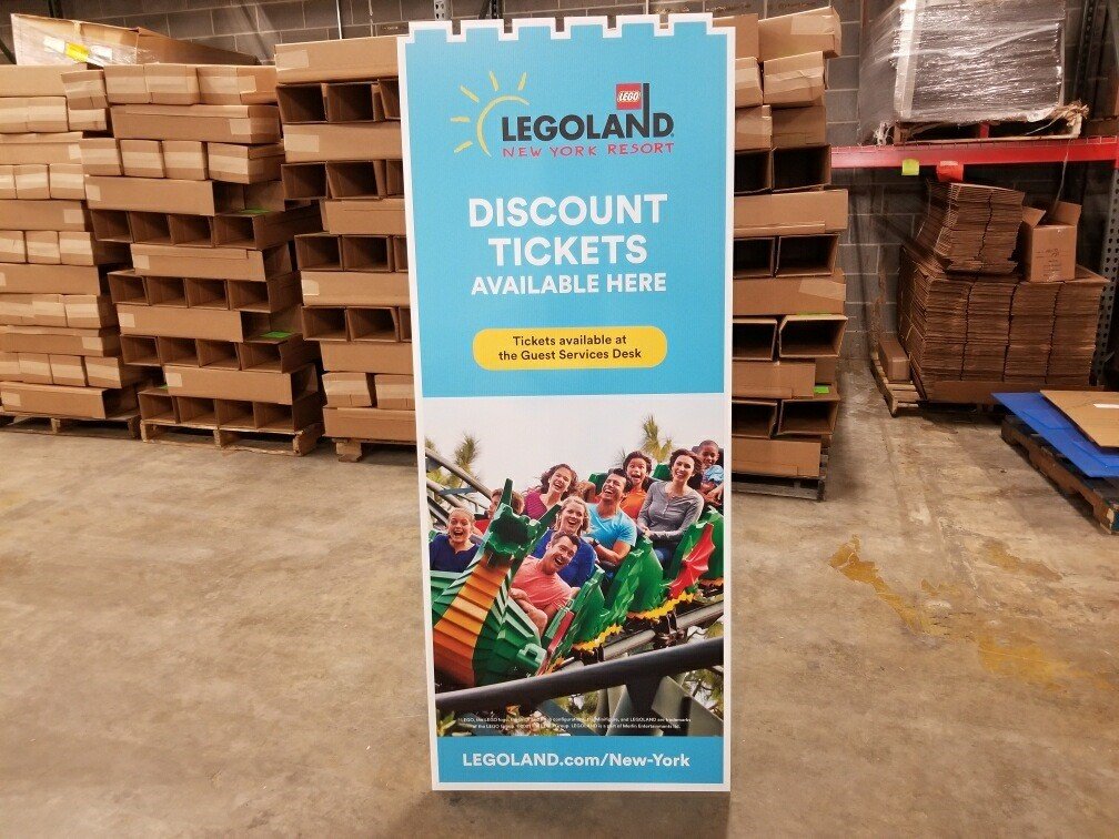
Britesign Design for LEGOLAND Discovery Center


Senior trade Graphic Designer
| LEGOLAND, Madame Tussauds, SEA LIFE Aquariums
Design & Brand Guardianship for the theme parks & entertainment industry is a fast paced and demanding role to fill. It requires adaptability, in depth knowledge, and problem solving as a base part of your toolkit.
However the pay off to those challenges is a fun and engaging work place that utilizes both your creative skills and your interpersonal skills. At Merlin Entertainments I provided print & digital design for several well known IPs. In my role as graphic designer for the Trade sales group I managed trade design needs for LEGOLAND Parks, Madame Tussaud’s, SEA LIFE Aquariums, The SanFrancisco Dungeon & More!
Over the course of the pandemic as freelance budgets got cut I also stepped in to cover in attraction needs & contributed to the national re-brand of Madame Tussaud’s. Those extra contributions were recognized with my promotion to Senior Trade Designer!
WANTMAN GROUP, INC.

Marketing Designer
| Civil Engineering PRofessional MArketing
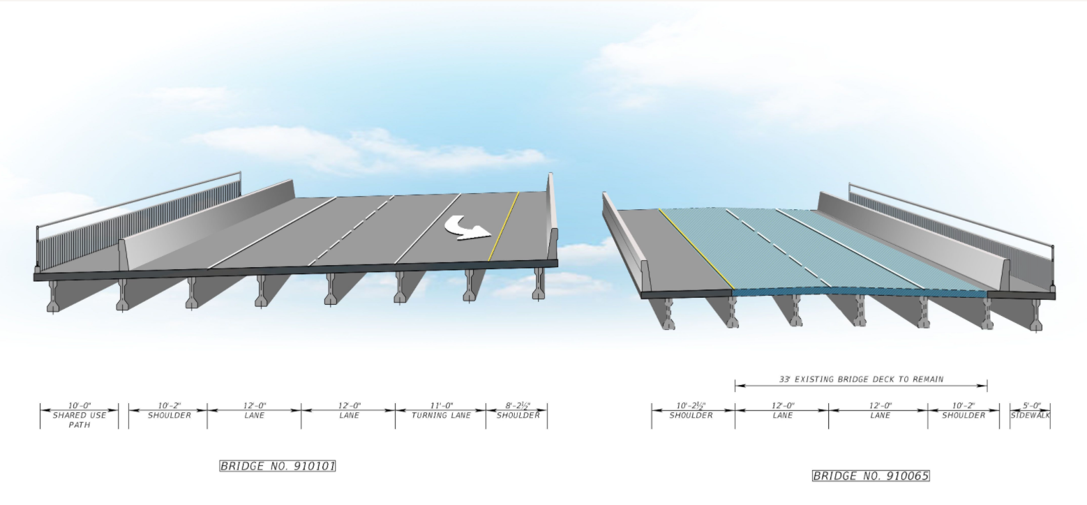
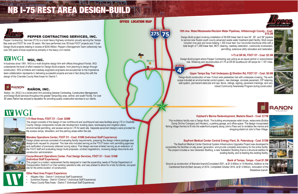
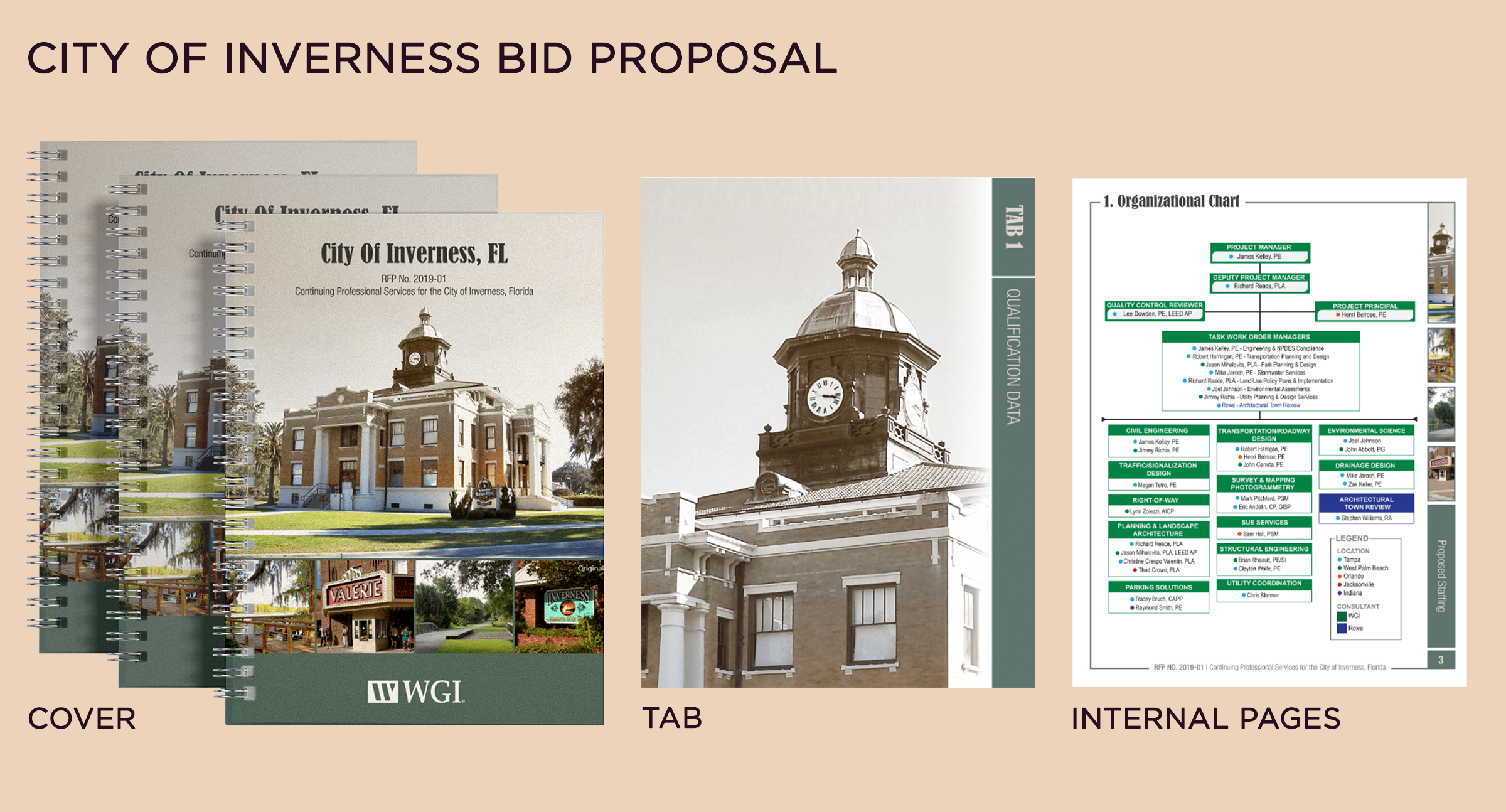
When working for a civil engineering firm the creative needs cover a vast range of communications both internal and bid focused.
I had to be a multifaceted graphic artist covering everything the firm needed, including but not limited to: isometric mock ups of roads being designed, bid package/booklet layout, resume design, packaging design, internal communications & brand design. As well as offering spot illustrations here and there to pep up internal communications and spec work handled by the creative team! On top of all design responsibilities I also managed relationships with our printers for specialty projects, even doing coil binding and printing myself for smaller bids.
There is never a dull moment when working in professional services marketing. Between emergency projects and hard federal deadlines you learn to problem solve on your feet.

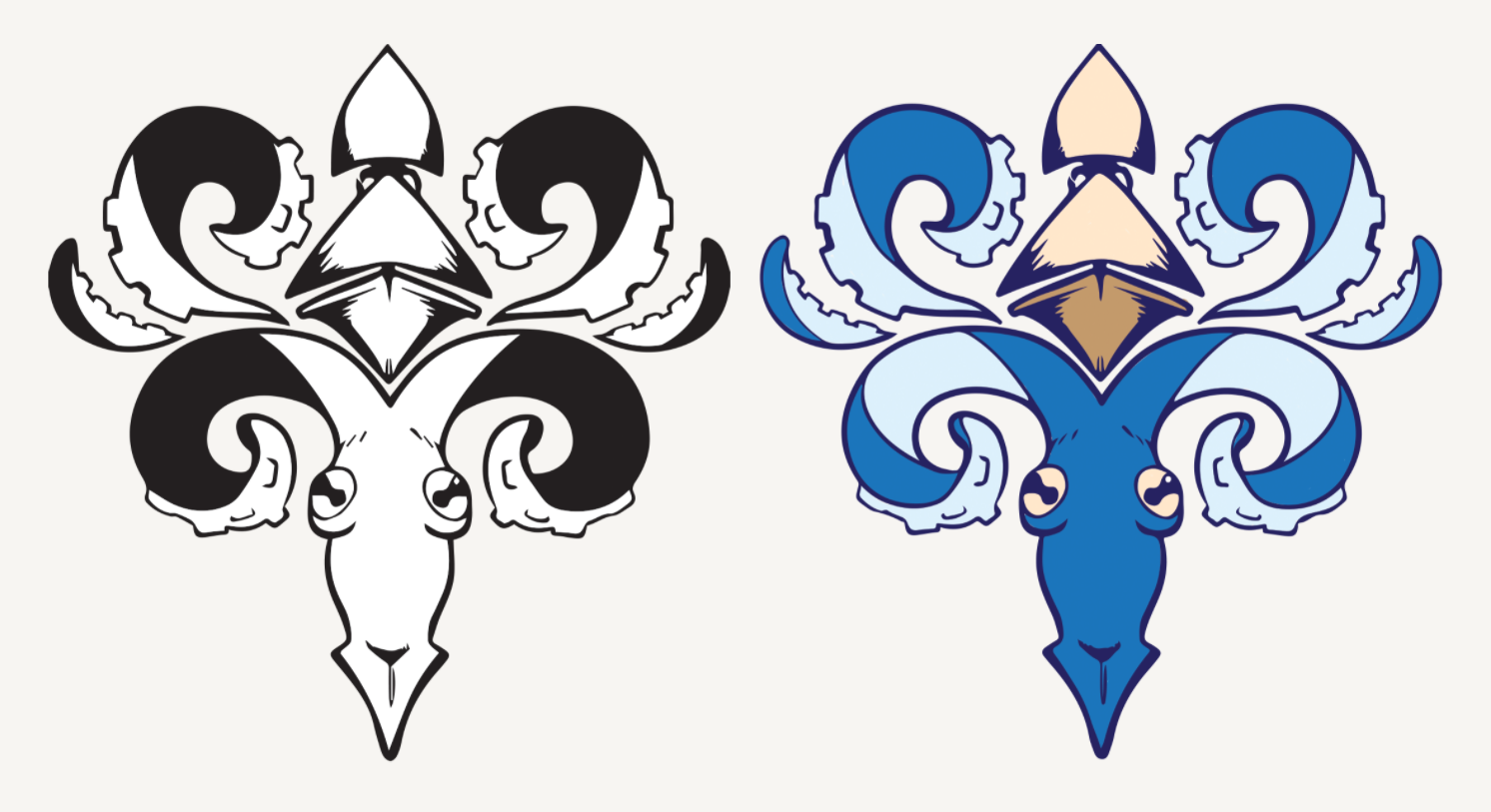
IRON HORSE INVESTMENTS & CONSULTING
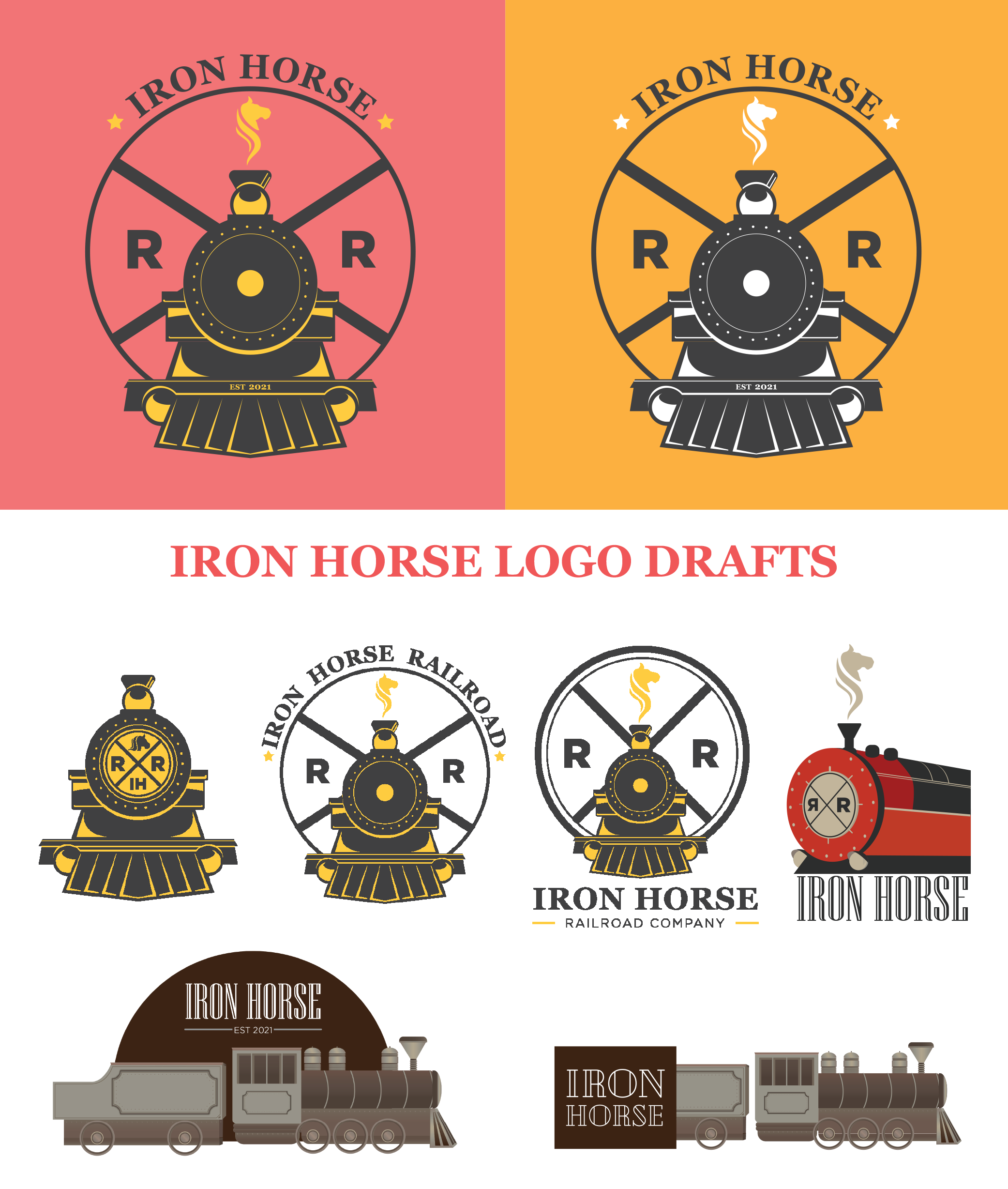
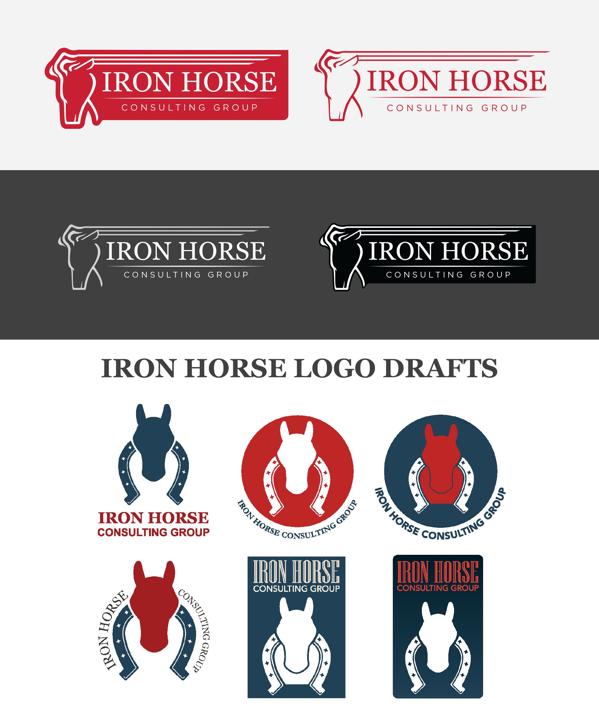
IRON HORSE | Two Logos
Recently I was approached by a client to create two logos for a pair of companies he was starting, One a railroad investment company and the other a consulting group.
Originally for the railroad company, he had requested that I create a Wells Fargo style illustrated logo. We went through a few options and angles and I was asked to incorporate lots of specific iconography like the railroad sign and the horse shaped smoke. The client eventually chose a flat design with red gold and black colors.
For the Consulting company we went though an even wider range of concepts. A wide variety of shapes and symbols were tested until we finally landed on using the horse head shape as a container and as the imagery for the logo itself.
JENNIFERLEE GREGORY ART CENTER
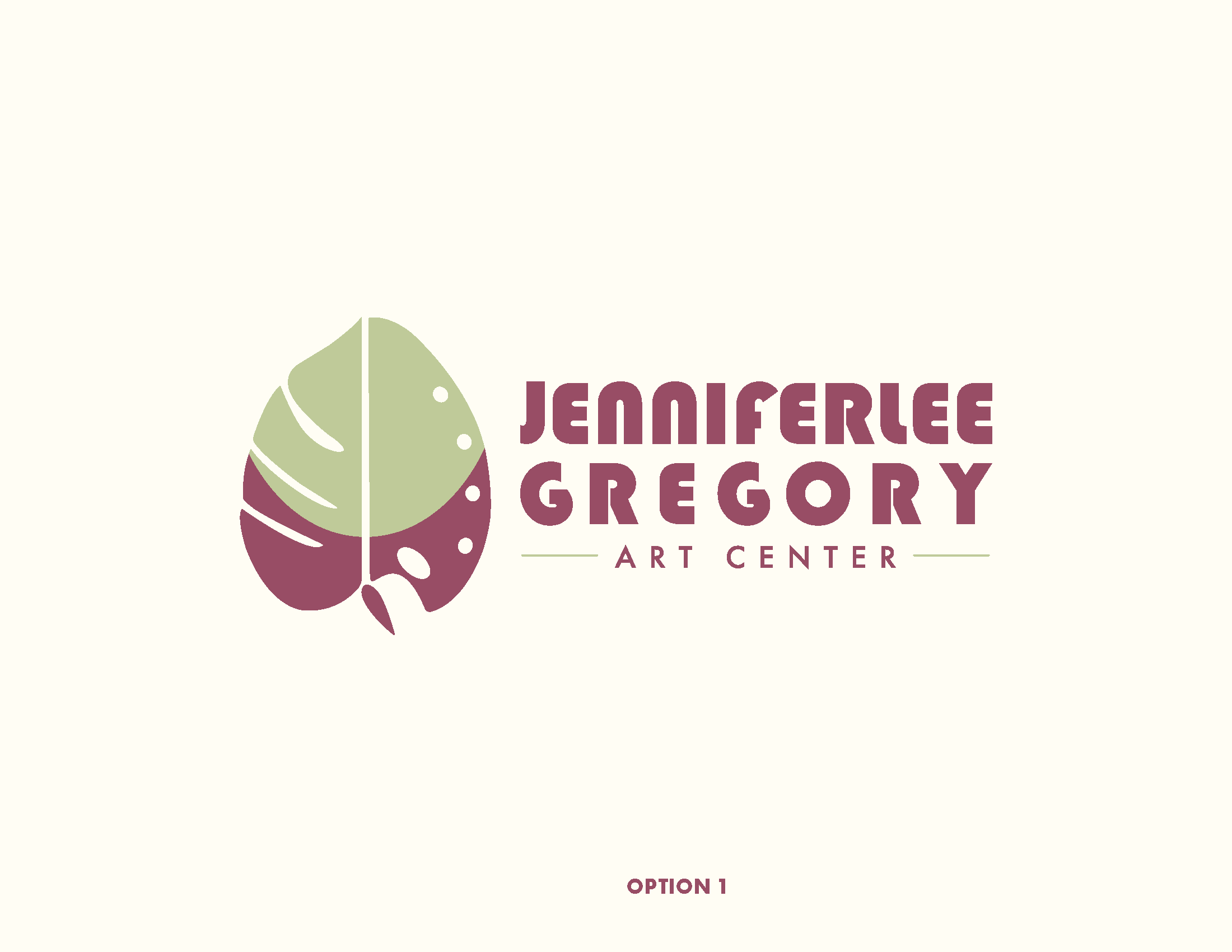
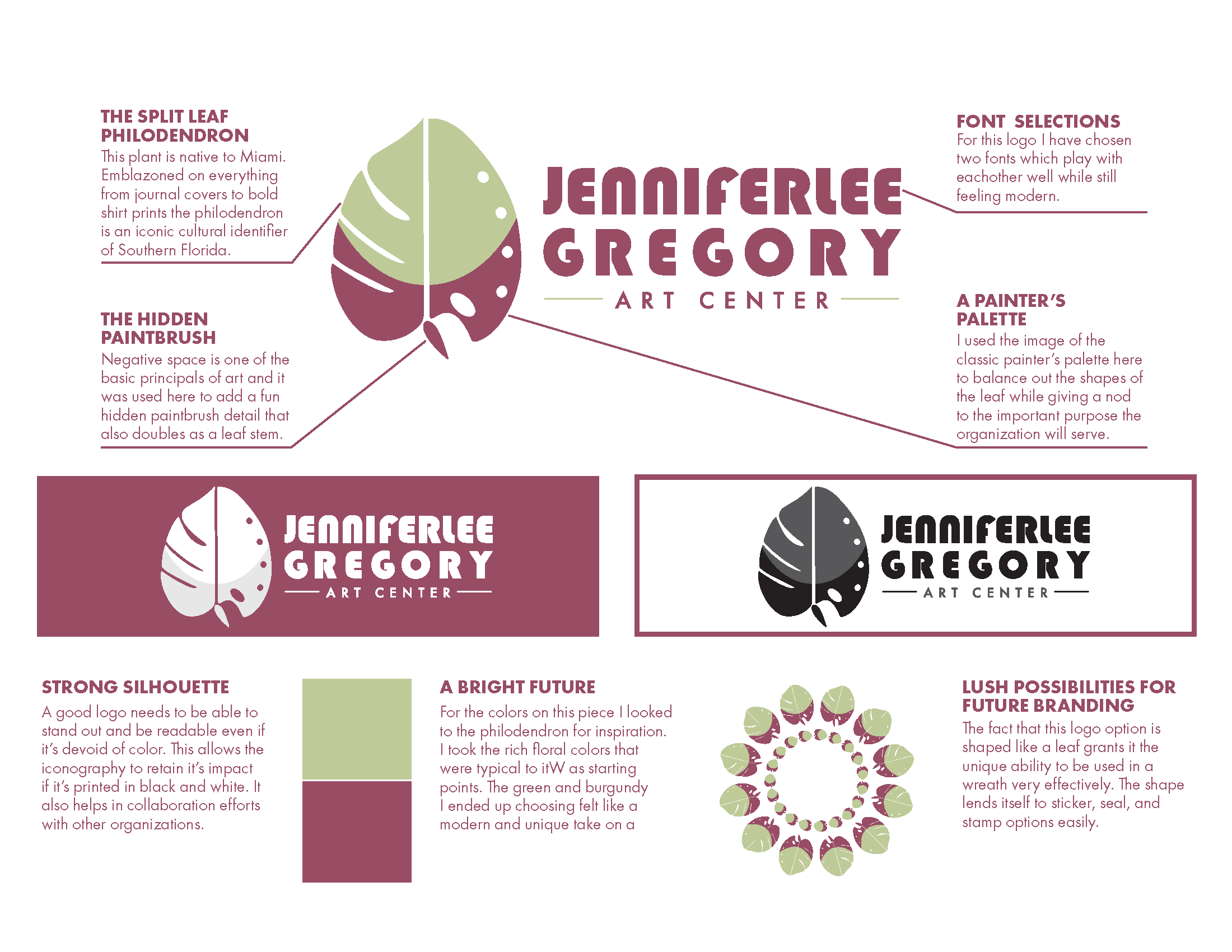
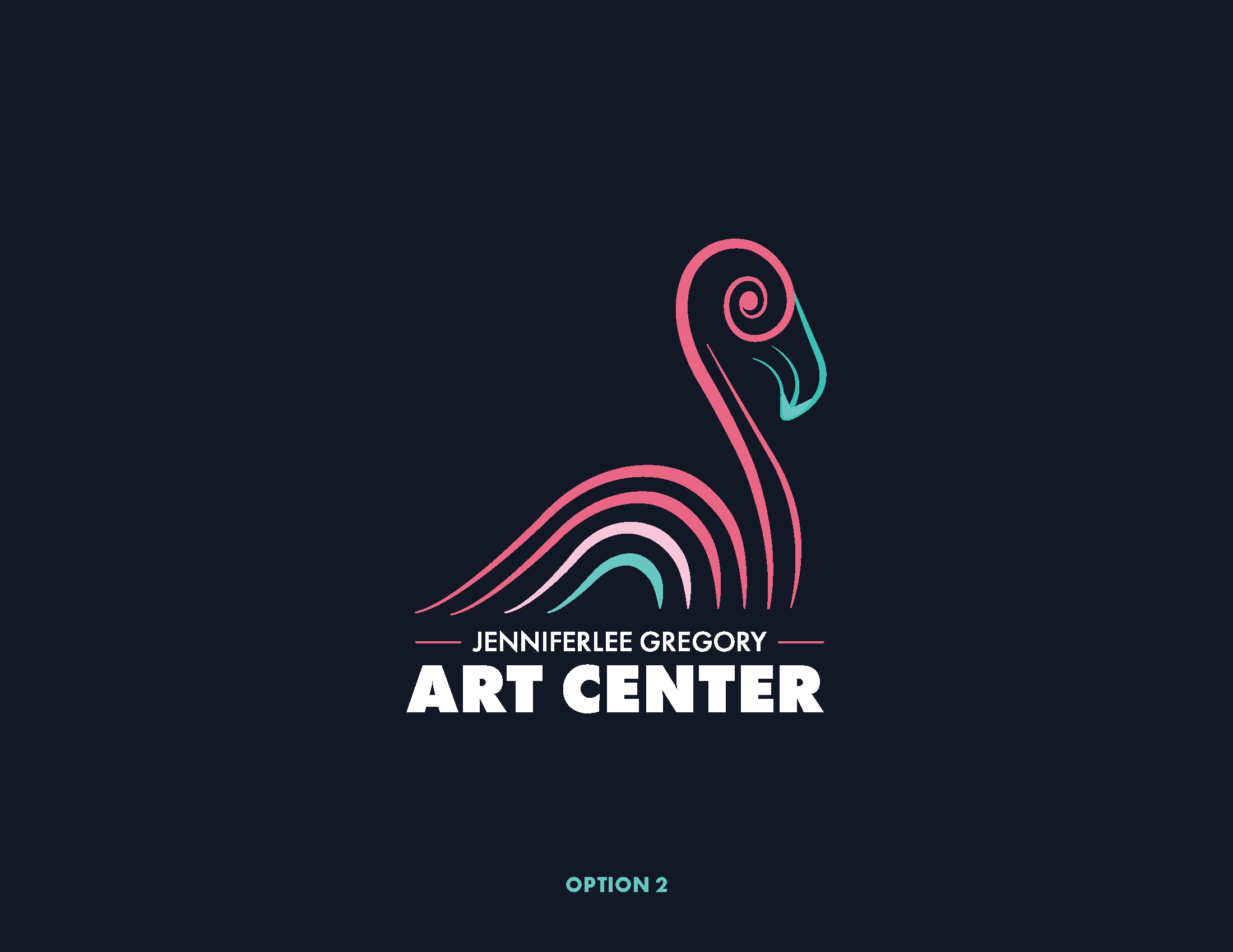
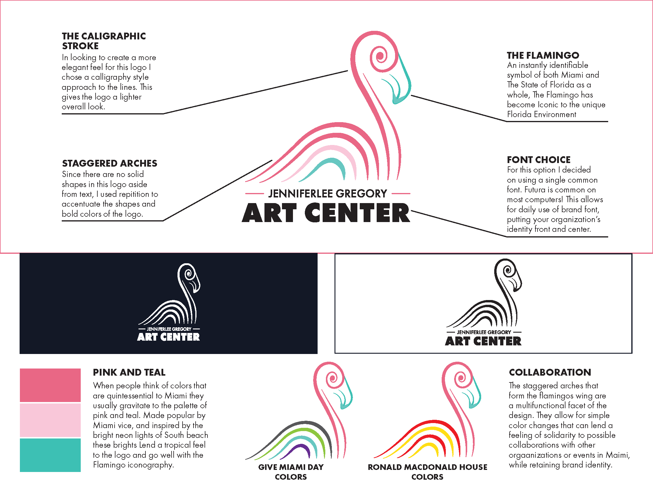
Art Center | Logo Pitch
In 2019 I was invited to submit a pitch for the creation of a logo for a non profit that was seeking funding in Miami. I was given the freedom to create 2 logos with only the parameters of being art & Miami related.
With the non profit being children’s art related I wanted the imagery to be fun and multi-functional. I took the approach of using vibrant and recognizable imagery to create these logos eventually landing on a flamingo and a native plant to Miami called the split leaf philodendron.
I used the colors and shapes of each logo to create adaptable imagery that the foundation could use to interact with the vivid art scene in Miami.